Colors Influence on Marketing
- Cailyn Chrystal
- June 8, 2016
- Advice, Branding, Business, Cailyn Chrystal, Design, Marketing, Strategy, Uncategorized
- branding, color, Creative, logo development, marketing psychology
- 0 Comments
I was recently picking out wrapping paper for a friend’s birthday gift, when a pink-coral paper with gold pineapples caught my eye. It immediately made me feel happy and even though it was double the price of the other wrapping papers, I had to go with the prettier choice. But I just couldn’t figure out why I thought it was prettier to me? I realized this decision was made solely on the color and how it made me feel, which made me think about just how much color affects our everyday life.
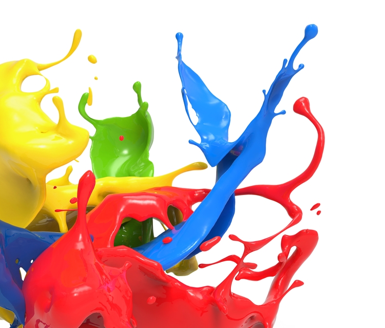
Colors influence marketing, not just in my overpriced wrapping paper choices, in a huge way. There is no greater evidence of this than how companies choose a color for their brand/logo. Companies spend thousands of dollars researching and creating different font treatments, images, icons and designs that represent them. However, a colors influence in marketing is the most important element to any company’s marketing efforts, especially it’s own branding.
While research pertaining to the influence and emotional triggers color can evoke is subjective, it is becoming a very popular topic growing in popularity and focus, especially as it relates to a colors influence on marketing efforts. Color is a powerful communication tool and can be used to signal a call to action, influence someone’s mood and even cause certain physiological and physical reactions. Certain colors have even been associated with increasing blood pressure, increasing metabolism and eyestrain. Color is the most powerful and influential attribute to any branding and marketing efforts a company creates, which is why it is the first step that any company should consider when undertaking these actions.
But how do you know what color is good for a company and a how a colors influence on marketing will help your brand? 898 Marketing helps clients, especially established companies looking to breath a new life into their brand, answer this question. But for you, we wanted to give you a little insight into what some colors mean and how to maximize a colors influence on marketing.
SEEING RED
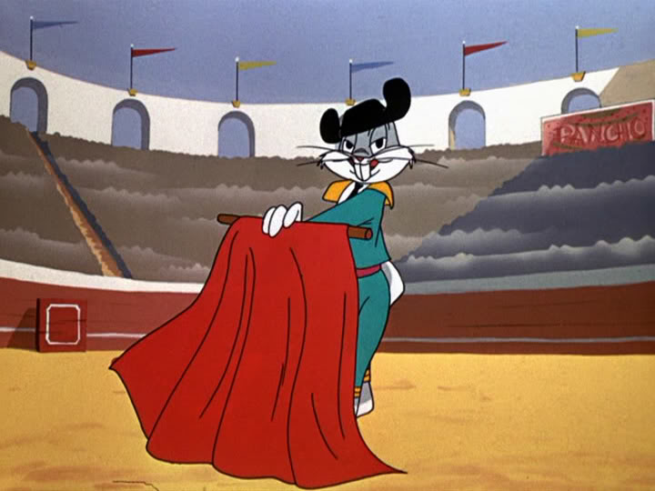
The color RED is one of the most attention grabbing colors used in signage and logos. Some of the biggest and most recognized brands in the world, like Coca-Cola, CNN, ESPN, Netflix and so many more, use RED to scream their presence. Many brands choose the color RED because it is eye catching and stands out. Several ancient Egyptian and Asian cultures that used chromotherapy, or the use of color to heal, saw the color red as a way to stimulate the body, the mind and to increase circulation. In today’s society, RED often is associated with fear and aggression. In recent studies, the color RED causes people to react with greater speed and force, something that has been making a more drastic impact in the world of athletics. For all of these reasons, and more, RED is clearly the color to use when you want a customer to take action.
AND IT WAS ALL YELLOW
Looking to get noticed? Try using the color YELLOW, the most visible and attention-grabbing color available. YELLOW, known to be a cheery, optimistic color, is associated with happiness and positivity. YELLOW is also a color that shows increases metabolism. But not everything is all sunshine with this color. YELLOW is the most fatiguing color on the eye because it reflects the highest amount of light. If YELLOW is going to be used, refrain from using it as a background on paper or computer monitors, as it can lead to eyestrain or even vision loss in extreme cases. YELLOW is complex, energetic and a great color that has been embraced by companies like Best Buy, Sprint, Chevrolet, UPS and, one of the largest brands to standout in any country, McDonald’s.
GREEN WITH ENVY
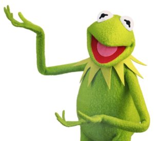 I love this line because it is probably best encompasses the impact a color has on an individual. While GREEN is associated with anything symbolizing nature or the natural world, it is one of the “luckiest” colors in the pallette wheel. Seen as a symbol of peace, tranquility and calmness, GREEN is a color that screams growing wealth and, something that comes along with that success, jealousy. From a design standpoint, research has found that GREEN improves reading ability, increasing overall reading speed and comprehension. BP, Huntington Bank, Monster Energy, John Deere and the Girl Scouts all use GREEN as their primary color. Another company that uses green in their logo, and used 898 Marketing for our consultative and developmental expertise to help them with their logo is the Mill Creek MetroPark. The Metroparks were looking for a more contemporary and viable brand revision that not only made them more modern, but gave them an emotional connection to the hundreds of thousands of residents who used its facilities every year. Varying hues of GREEN, were used to create a dynamic logo that is taking the brand into the future by always reminding people there is something to explore, experience and enjoy in the natural beauty that is Mill Creek Metroparks. CLICK HERE to read more about what 898 Marketing was able to do for the Mill Creek MetroParks.
MY BLUE HEAVEN
While it is our founder’s favorite color, there was a lot more thought and consideration that went into choosing BLUE as our company’s primary color for our logo here at 898 Marketing. If you look at our logo, you will see that we chose a pretty simple, clean design with BLUE being the dominant color. We chose this because BLUE is affiliated with trust, reliability, responsibility, dependability and professionalism. While BLUE can make people feel sad and aloof sometimes, something that we at 898 Marketing are not, BLUE is the color that produces the most productivity out of people when it is present. We like to think that we bring a sense of calmness, inspiration and productivity to our clients so using BLUE was a logical choice. Not only does 898 Marketing use BLUE, but companies like GE Lighting, a fellow client of 898 Marketing, American Express, Facebook, AT&T and Oreo are brands who embrace being BLUE.
WHAT COLOR ARE YOU?
While I could go on for hours about the feelings and emotions behind each color, CLICK HERE to learn more about the feelings associated with each color.
As I mentioned earlier, the topic of color psychology is subjective. Generally speaking, certain colors evoke certain emotions. However, gender, culture, and other factors may affect how color is perceived. When it comes to purchasing decisions, color plays a huge part in what people decide to buy. According to a recent infographic produced by KissMetrics, 85% of people say that color is a primary reason for why they buy a particular product. From my own experiences, there have been plenty of times I’ve chosen a product with pretty colored packaging over the one with the boring packing even though it probably had a lower price tag. Companies know and understand this very well, and they know not just any color will do.
The color you choose to represent your company should match up with how you want your brand to come across to consumers and the feelings you want them to have when they think of or see your logo. Whether you are starting a new company or just want to modernize and freshen up your existing logo, make sure to do your homework and understand that colors influence marketing and the future of your brand.
About the Author
 Cailyn Chrystal is a Project Manager at 898 Marketing. Cailyn develops strategies and manages implementation of content through social media channels for 898 Marketing and it’s clients, as well as optimization strategies for websites and content. Cailyn is a native of Youngstown, Ohio, and a graduate of Duquesne University where she earned her Bachelor’s Degree in Marketing Communications.
Related Posts


Recent Comments