The Psychology of Color in Branding
- Jaclyn DiDomenico
- August 23, 2021
- Blogs
- creative design, graphic design, marketing psychology
- 0 Comments
At one point or another, I’m sure you have heard or used the phrase, “You only have one chance to make a first impression.” What you may not have known, though, is that it applies to more than just meeting someone for the first time. As a business, your logo and brand are the first thing people recognize about you, so you have to make sure their first impression of your business is unforgettable. There are many ways to make that impression stick, and as a graphic designer, the best way to start is by strategically choosing the right colors to represent your brand. Certain colors can evoke a subconscious emotional response with your consumer, leading them to associate those feelings with your company. Here are some ways that you can use the psychology of colors to influence your brand image, and some of the feelings associated with certain colors.
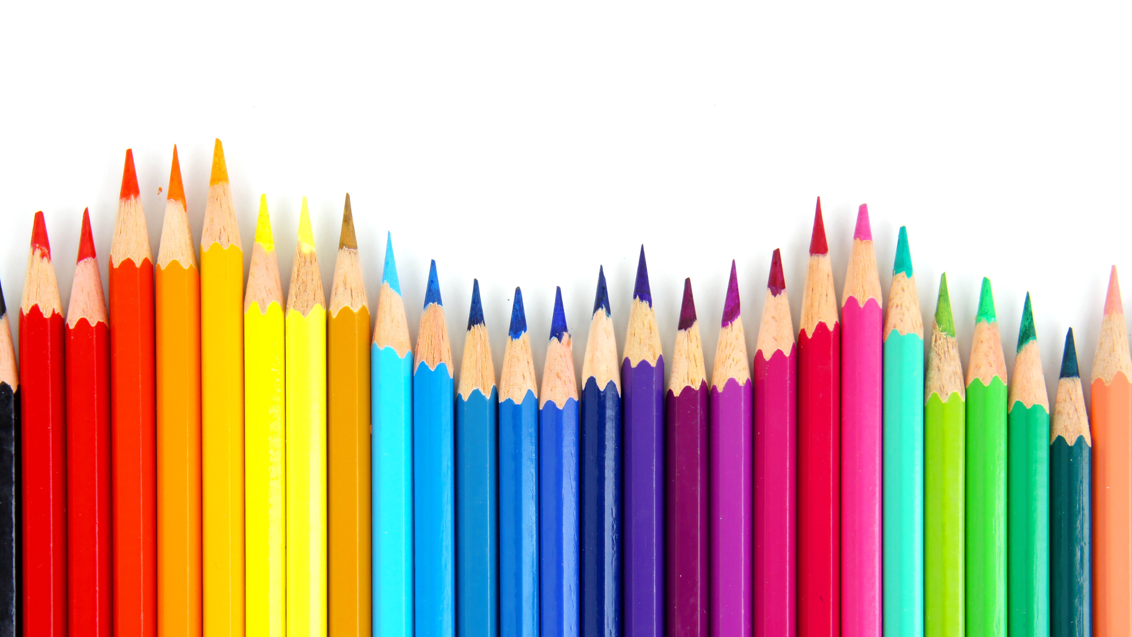
People and Their Reaction to Colors
There are several factors that influence an individual’s reaction to certain colors, such as gender, past experiences, and cultural differences. As a designer, it is important to understand how these colors will influence someone’s feelings about your brand. Choosing colors that work well together can make or break your brand’s identity. To make sure we use the right colors, we can refer to the hierarchy of colors, which shows primary colors and the secondary colors that work well together. Knowing the proper color combinations can help you in creating a logo that not only stands out, but evokes a positive feeling with consumers.
Know Your Competition
In order to stand out, it is important to consider what your competitors are doing in terms of color and logo. Choosing colors that give your brand its own personality will help set you apart from the competition. For example, Pepsi uses a blue color palette (symbolizing loyalty and trust) to stand out against Coca-Cola’s red color palette (symbolizing strength and passion). Regardless of which soft drink you prefer, the two evoke unique emotional responses thanks to their color palettes.
What Colors Represent
Now that we’ve talked about how colors impact your brand identity, we can talk about what some common colors can symbolize.
- Red – Power, Strength, Passion, Excitement
- Orange – Courage, Confidence, Warmth, Innovation, Friendliness
- Yellow – Optimism, Happiness, Creativity, Intellect, Extraversion
- Blue – Trust, Loyalty, Dependability, Security
- Purple – Wisdom, Luxury, Wealth, Spirituality
- Black – Sophisticated, Security, Elegance, Authority
- Gray – Neutrality, Balance, Reliability, Timelessness
- White – Cleanness, Clarity, Purity, Simplicity
Many of the world’s most famous brands use the colors listed above, such as Coca-Cola, Amazon, McDonald’s, American Express, Welch’s, Nike, and Apple. These are some colors to consider the next you create a logo for a company.
Choosing a color palette is a critical first step in creating a positive brand identity. While there is no clear set of guidelines, it’s important to consider who your target audience is, what your competitors are doing, and the personality you are trying to create. The next time you start developing a brand, choosing colors is an excellent place to begin. Best of luck in your next branding project!
About The Author

Related Posts


Recent Comments